K-Means、MeanShift聚类实战与KNN对比
使用 sklearn.cluster 模块可以对未标记的数据进行聚类。对于这类非监督的聚类算法来说,因为数据都是未标记的,所以模型训练完毕后得到的结果可能是与真实标记结果匹配不上的,需要手动矫正一下数据。对于 K-Means 算法来说,我们需要指定一个类别数量。Mean-shift 只需要根据指定的采样数量,自行计算搜索半径,不需要手动指定簇的数量(这里说的簇也就是类别,在 Sklearn 的文档里都叫做簇)。最后会对比一下有监督学习的 KNN 算法,看看效果。
1、采用 Kmeans 算法实现2D数据自动聚类,预测 V1=80,V2=60 数据类别;
2、计算预测准确率,完成结果矫正
3、采用 KNN、Meanshift 算法,重复步骤1-2
K-Means实现聚类
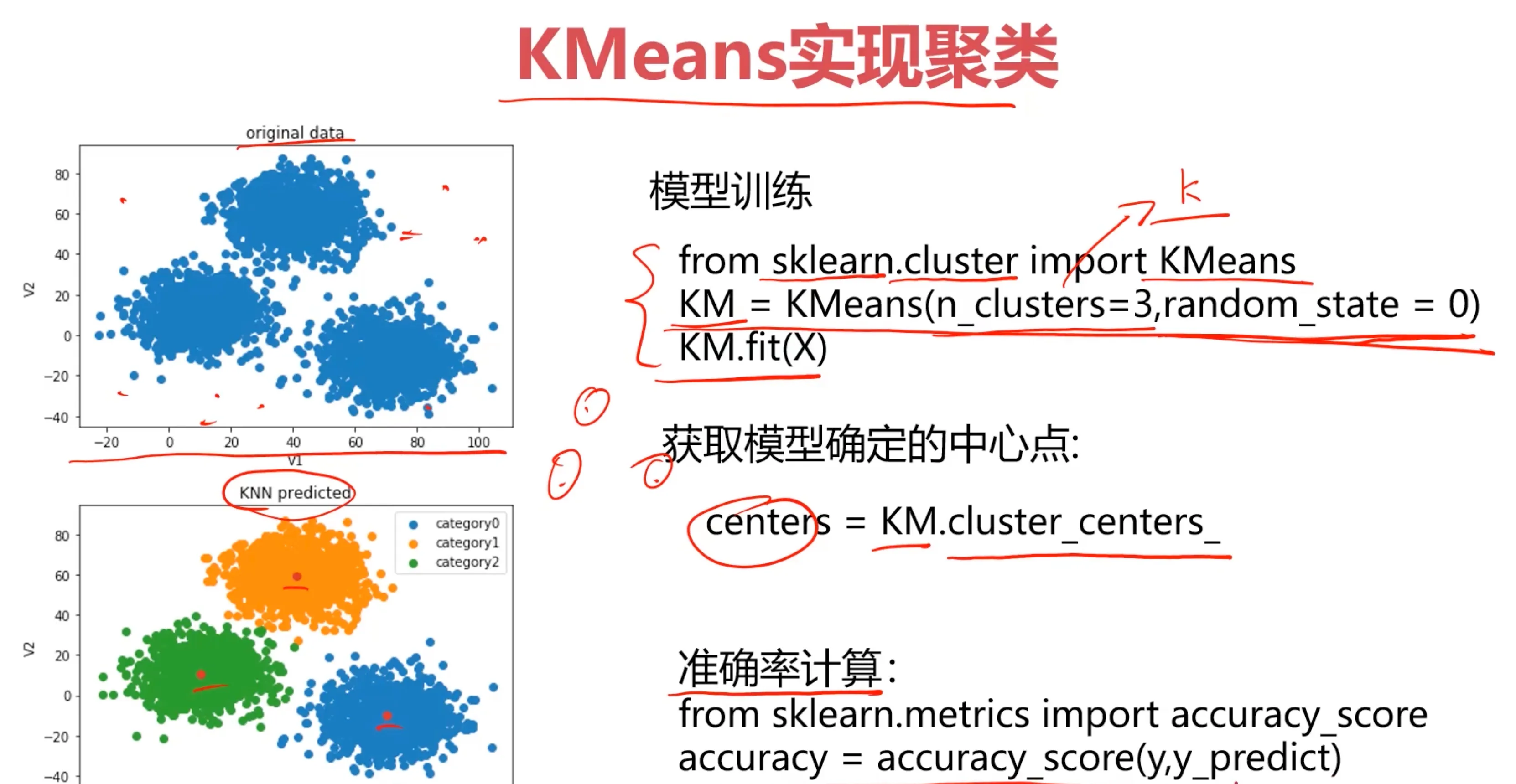
 核心步骤就是:加载数据 - 训练模型 - 矫正结果
#load the data
import pandas as pd
import numpy as np
data = pd.read_csv('data.csv')
data.head()
| V1 | V2 | labels | |
|---|---|---|---|
| 0 | 2.072345 | -3.241693 | 0 |
| 1 | 17.936710 | 15.784810 | 0 |
| 2 | 1.083576 | 7.319176 | 0 |
| 3 | 11.120670 | 14.406780 | 0 |
| 4 | 23.711550 | 2.557729 | 0 |
#define X and y 因为不需要后面的类型标记
X = data.drop(['labels'],axis=1)
y = data.loc[:,'labels']
# X.head()
y.head()
0    0
1    0
2    0
3    0
4    0
Name: labels, dtype: int64
# y有多少类别
pd.value_counts(y)
labels
2    1156
1     954
0     890
Name: count, dtype: int64
%matplotlib inline
from matplotlib import pyplot as plt
fig1 = plt.figure()
plt.scatter(X.loc[:,'V1'],X.loc[:,'V2'])
plt.title("un-labled data")
plt.xlabel('V1')
plt.ylabel('V2')
plt.show()
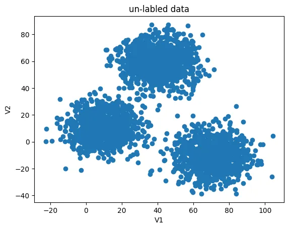
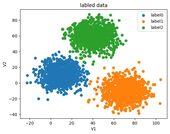
这样看的话不太直观,原始数据的分类也表示出来:
fig2 = plt.figure()
label0 = plt.scatter(X.loc[:,'V1'][y==0],X.loc[:,'V2'][y==0])
label1 = plt.scatter(X.loc[:,'V1'][y==1],X.loc[:,'V2'][y==1])
label2 = plt.scatter(X.loc[:,'V1'][y==2],X.loc[:,'V2'][y==2])

plt.title("labled data")
plt.xlabel('V1')
plt.ylabel('V2')
plt.legend((label0,label1,label2),('label0','label1','label2'))
plt.show()
# 导入并创建模型,这里指定簇的数量是3
from sklearn.cluster import KMeans
KM = KMeans(n_clusters=3,random_state=0)


# 训练模型
KM.fit(X)
| KMeans(n_clusters=3, random_state=0) |
|---|
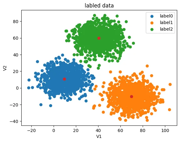
# 获得中心点并展示在原带分类的图中
centers = KM.cluster_centers_

fig3 = plt.figure()
label0 = plt.scatter(X.loc[:,'V1'][y==0],X.loc[:,'V2'][y==0])
label1 = plt.scatter(X.loc[:,'V1'][y==1],X.loc[:,'V2'][y==1])
label2 = plt.scatter(X.loc[:,'V1'][y==2],X.loc[:,'V2'][y==2])

plt.title("labled data")
plt.xlabel('V1')
plt.ylabel('V2')
plt.legend((label0,label1,label2),('label0','label1','label2'))
plt.scatter(centers[:,0],centers[:,1])
plt.show()
预测 V1=80, V2=60的时候的数据类别
y_predict_test =  KM.predict([[20,20]])
print(y_predict_test)
[2]
这里打印出来是 [2] ,但我们并不知道模型的 [2] 表示的是哪一类。
所以我们基于此模型,输入原数据看看预测的结果是什么:
#predict based on training data
y_predict = KM.predict(X)
print(pd.value_counts(y_predict),pd.value_counts(y))
0    1149
1     952
2     899
Name: count, dtype: int64 labels
2    1156
1     954
0     890
Name: count, dtype: int64
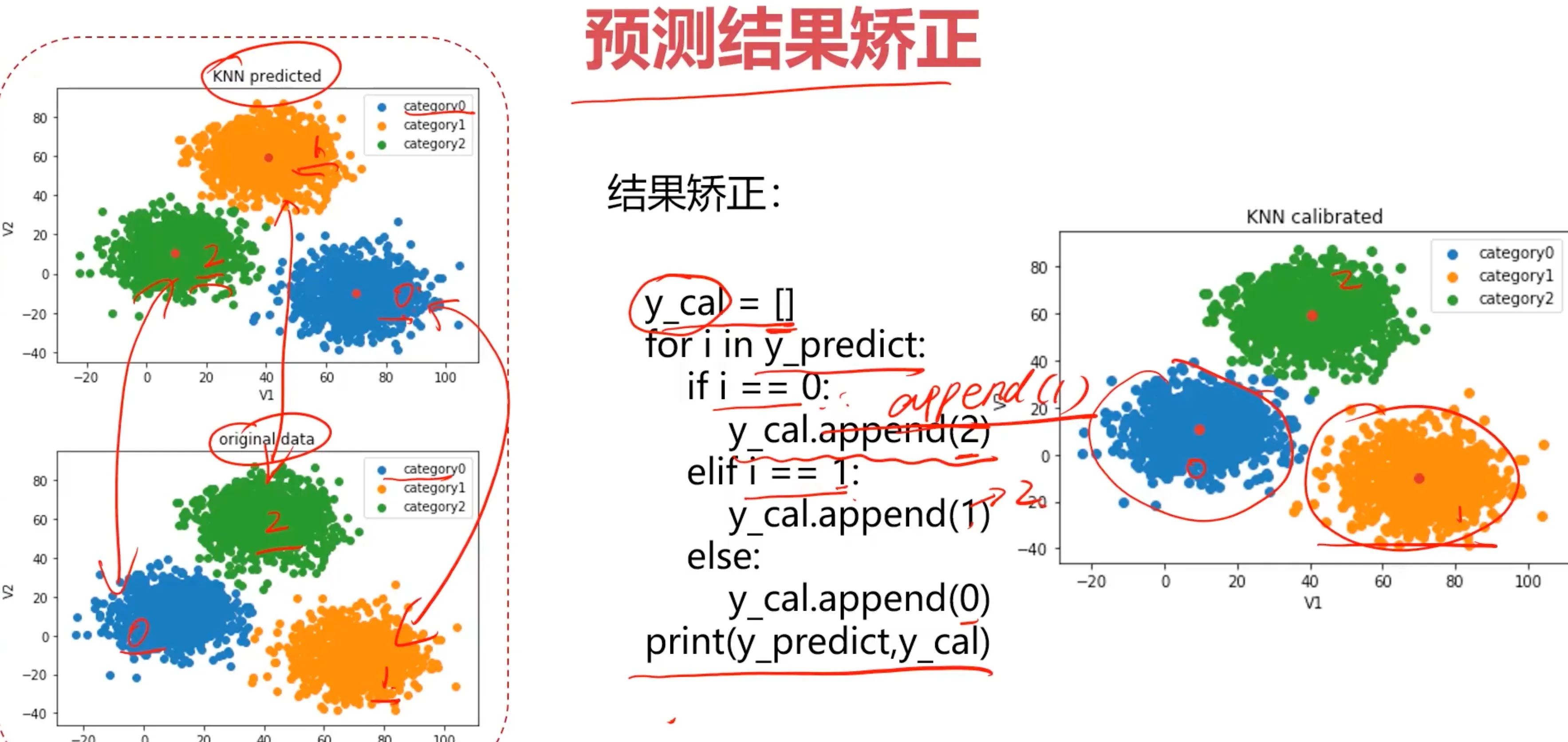
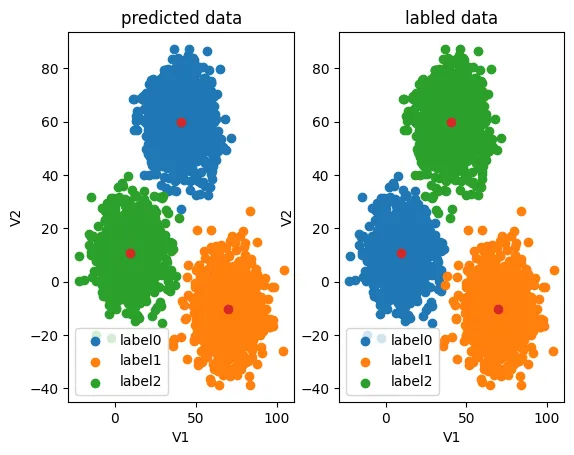
可以看到预测的 [2] 类对应着原数据的 [0] 类,预测的 [0] 类对应着原数据的 [2] 类,预测的 [1] 类对应着原数据的 [1] 类,所以接下来要做的事情就是校正结果。
from sklearn.metrics import accuracy_score
accuracy = accuracy_score(y,y_predict)
print(accuracy)
0.31966666666666665
不经过校正的数据,只有0.31的准确率,这里有0.31是因为预测的 [1] 类还是对应着原数据的 [1] 类,完全有可能只有0.01以下的准确度,所以只要校正结果,就能得到较高的正确率,在此之前先看看预测结果与原数据的对比:
#visualize the data and results
fig4 = plt.subplot(121)
label0 = plt.scatter(X.loc[:,'V1'][y_predict==0],X.loc[:,'V2'][y_predict==0])
label1 = plt.scatter(X.loc[:,'V1'][y_predict==1],X.loc[:,'V2'][y_predict==1])
label2 = plt.scatter(X.loc[:,'V1'][y_predict==2],X.loc[:,'V2'][y_predict==2])

plt.title("predicted data")
plt.xlabel('V1')
plt.ylabel('V2')
plt.legend((label0,label1,label2),('label0','label1','label2'))
plt.scatter(centers[:,0],centers[:,1])

fig5 = plt.subplot(122)
label0 = plt.scatter(X.loc[:,'V1'][y==0],X.loc[:,'V2'][y==0])
label1 = plt.scatter(X.loc[:,'V1'][y==1],X.loc[:,'V2'][y==1])
label2 = plt.scatter(X.loc[:,'V1'][y==2],X.loc[:,'V2'][y==2])

plt.title("labled data")
plt.xlabel('V1')
plt.ylabel('V2')
plt.legend((label0,label1,label2),('label0','label1','label2'))
plt.scatter(centers[:,0],centers[:,1])
plt.show()
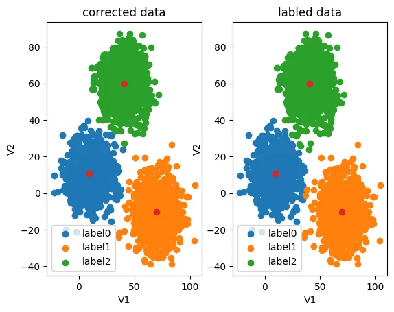
校正数据:
#correct the results
y_corrected = []
for i in y_predict:
    if i==0:
        y_corrected.append(2)
    elif i==2:
        y_corrected.append(0)
    else:
        y_corrected.append(1)
print(pd.value_counts(y_corrected),pd.value_counts(y))
2    1149
1     952
0     899
Name: count, dtype: int64 labels
2    1156
1     954
0     890
Name: count, dtype: int64
现在类别对应上了,看看评估分数高达0.997
print(accuracy_score(y,y_corrected))
0.997
y_corrected = np.array(y_corrected)
print(type(y_corrected))
<class 'numpy.ndarray'>
再看看预测结果与原数据的对比图,现在就对上了:
fig6 = plt.subplot(121)
label0 = plt.scatter(X.loc[:,'V1'][y_corrected==0],X.loc[:,'V2'][y_corrected==0])
label1 = plt.scatter(X.loc[:,'V1'][y_corrected==1],X.loc[:,'V2'][y_corrected==1])
label2 = plt.scatter(X.loc[:,'V1'][y_corrected==2],X.loc[:,'V2'][y_corrected==2])

plt.title("corrected data")
plt.xlabel('V1')
plt.ylabel('V2')
plt.legend((label0,label1,label2),('label0','label1','label2'))
plt.scatter(centers[:,0],centers[:,1])

fig7 = plt.subplot(122)
label0 = plt.scatter(X.loc[:,'V1'][y==0],X.loc[:,'V2'][y==0])
label1 = plt.scatter(X.loc[:,'V1'][y==1],X.loc[:,'V2'][y==1])
label2 = plt.scatter(X.loc[:,'V1'][y==2],X.loc[:,'V2'][y==2])

plt.title("labled data")
plt.xlabel('V1')
plt.ylabel('V2')
plt.legend((label0,label1,label2),('label0','label1','label2'))
plt.scatter(centers[:,0],centers[:,1])
plt.show()
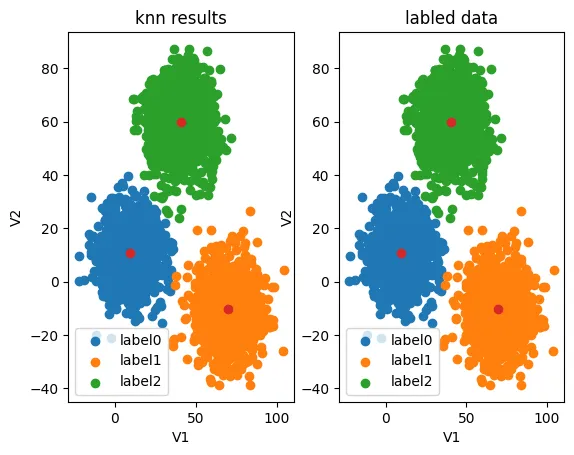
KNN与K-Means对比
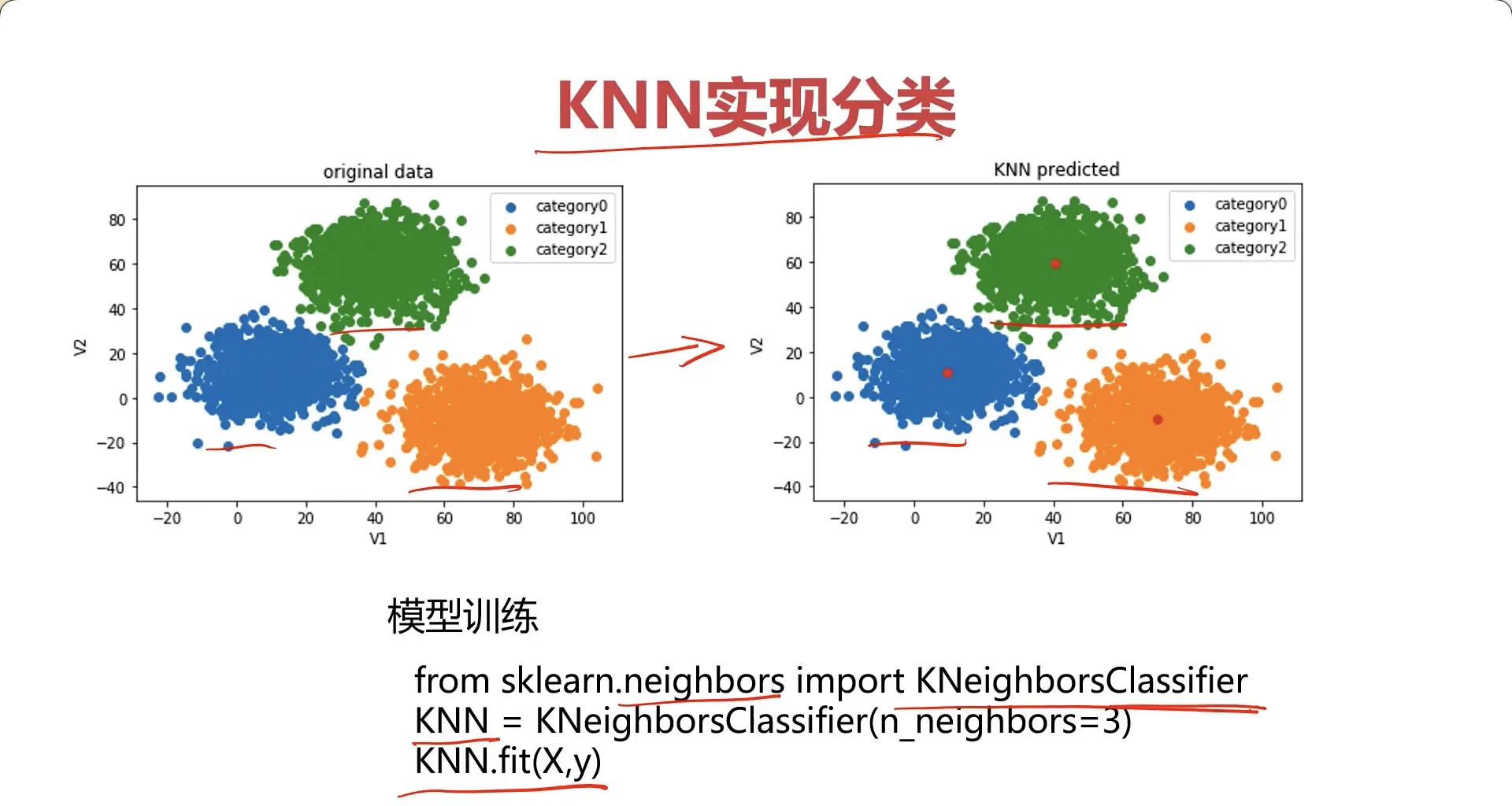
让我们用 KNN 来训练一下模型对比看一下效果:
#establish a KNN model
from sklearn.neighbors import KNeighborsClassifier
KNN = KNeighborsClassifier(n_neighbors=3)
KNN.fit(X,y)
| KNeighborsClassifier(n_neighbors=3) |
|---|
用训练好的模型预测 V1=80, V2=60的时候的数据类别:
#predict based on the test data V1=80, V2=60
y_predict_knn_test = KNN.predict([[80,60]])
y_predict_knn = KNN.predict(X)
print(y_predict_knn_test)
print('knn accuracy:',accuracy_score(y,y_predict_knn))
[2]
knn accuracy: 1.0
print(pd.value_counts(y_predict_knn),pd.value_counts(y))
2    1156
1     954
0     890
Name: count, dtype: int64 labels
2    1156
1     954
0     890
Name: count, dtype: int64
可以看到,KNN 因为训练的时候已经知道了数据的类别符号,所以结果也是能对上的,正确率达到了100%。
fig6 = plt.subplot(121)
label0 = plt.scatter(X.loc[:,'V1'][y_predict_knn==0],X.loc[:,'V2'][y_predict_knn==0])
label1 = plt.scatter(X.loc[:,'V1'][y_predict_knn==1],X.loc[:,'V2'][y_predict_knn==1])
label2 = plt.scatter(X.loc[:,'V1'][y_predict_knn==2],X.loc[:,'V2'][y_predict_knn==2])

plt.title("knn results")
plt.xlabel('V1')
plt.ylabel('V2')
plt.legend((label0,label1,label2),('label0','label1','label2'))
plt.scatter(centers[:,0],centers[:,1])

fig7 = plt.subplot(122)
label0 = plt.scatter(X.loc[:,'V1'][y==0],X.loc[:,'V2'][y==0])
label1 = plt.scatter(X.loc[:,'V1'][y==1],X.loc[:,'V2'][y==1])
label2 = plt.scatter(X.loc[:,'V1'][y==2],X.loc[:,'V2'][y==2])

plt.title("labled data")
plt.xlabel('V1')
plt.ylabel('V2')
plt.legend((label0,label1,label2),('label0','label1','label2'))
plt.scatter(centers[:,0],centers[:,1])
plt.show()
MeanShift实现聚类
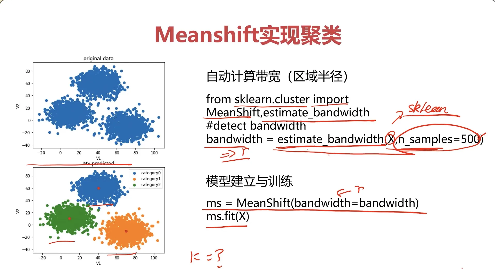
# MeanShift设置采样数量,可以自动获得搜索区域大小
from sklearn.cluster import MeanShift,estimate_bandwidth
#obtain the bandwidth
bw = estimate_bandwidth(X,n_samples=500)
print(bw)
30.84663454820215
#establish the meanshift model-un-supervised model
ms = MeanShift(bandwidth=bw)
ms.fit(X)
| MeanShift(bandwidth=30.84663454820215) |
|---|
通过查看各个类别的的数量也能发现,也是 MeanShift 也是需要进行数据校正的,因为 MeanShift 也是无监督学习,处理的都是未标记的数据:
y_predict_ms = ms.predict(X)
print(pd.value_counts(y_predict_ms),pd.value_counts(y))
0    1149
1     952
2     899
Name: count, dtype: int64 labels
2    1156
1     954
0     890
Name: count, dtype: int64
fig6 = plt.subplot(121)
label0 = plt.scatter(X.loc[:,'V1'][y_predict_ms==0],X.loc[:,'V2'][y_predict_ms==0])
label1 = plt.scatter(X.loc[:,'V1'][y_predict_ms==1],X.loc[:,'V2'][y_predict_ms==1])
label2 = plt.scatter(X.loc[:,'V1'][y_predict_ms==2],X.loc[:,'V2'][y_predict_ms==2])

plt.title("ms results")
plt.xlabel('V1')
plt.ylabel('V2')
plt.legend((label0,label1,label2),('label0','label1','label2'))
plt.scatter(centers[:,0],centers[:,1])

fig7 = plt.subplot(122)
label0 = plt.scatter(X.loc[:,'V1'][y==0],X.loc[:,'V2'][y==0])
label1 = plt.scatter(X.loc[:,'V1'][y==1],X.loc[:,'V2'][y==1])
label2 = plt.scatter(X.loc[:,'V1'][y==2],X.loc[:,'V2'][y==2])

plt.title("labled data")
plt.xlabel('V1')
plt.ylabel('V2')
plt.legend((label0,label1,label2),('label0','label1','label2'))
plt.scatter(centers[:,0],centers[:,1])
plt.show()
#correct the results
y_corrected_ms = []
for i in y_predict_ms:
    if i==0:
        y_corrected_ms.append(2)
    elif i==1:
        y_corrected_ms.append(1)
    else:
        y_corrected_ms.append(0)
print(pd.value_counts(y_corrected_ms),pd.value_counts(y))
2    1149
1     952
0     899
Name: count, dtype: int64 labels
2    1156
1     954
0     890
Name: count, dtype: int64
#convert the results to numpy array
y_corrected_ms = np.array(y_corrected_ms)
print(type(y_corrected_ms))
<class 'numpy.ndarray'>
看看数据校正后的结果:
fig6 = plt.subplot(121)
label0 = plt.scatter(X.loc[:,'V1'][y_corrected_ms==0],X.loc[:,'V2'][y_corrected_ms==0])
label1 = plt.scatter(X.loc[:,'V1'][y_corrected_ms==1],X.loc[:,'V2'][y_corrected_ms==1])
label2 = plt.scatter(X.loc[:,'V1'][y_corrected_ms==2],X.loc[:,'V2'][y_corrected_ms==2])

plt.title("ms corrected results")
plt.xlabel('V1')
plt.ylabel('V2')
plt.legend((label0,label1,label2),('label0','label1','label2'))
plt.scatter(centers[:,0],centers[:,1])

fig7 = plt.subplot(122)
label0 = plt.scatter(X.loc[:,'V1'][y==0],X.loc[:,'V2'][y==0])
label1 = plt.scatter(X.loc[:,'V1'][y==1],X.loc[:,'V2'][y==1])
label2 = plt.scatter(X.loc[:,'V1'][y==2],X.loc[:,'V2'][y==2])

plt.title("labled data")
plt.xlabel('V1')
plt.ylabel('V2')
plt.legend((label0,label1,label2),('label0','label1','label2'))
plt.scatter(centers[:,0],centers[:,1])
plt.show()
